
PROJECT
Passwordless Authentication UI
Making it easier for users to log in without having another username and password.
My role: UI/UX Design Project Manager
My contribution: I guided the UX team on how to run a RITE usability test and a Cognitive Walkthrough. I also led the UI Design to make sure it would meet user needs, and had final sign off on the completed UI Design.
Introduction:
There were complaints from customer service representatives that users were having difficulties logging into the bill pay patient portal. We evaluated the problem and derived a solution that fit within our technical limitations for a passwordless login experience and at the same time, we expanded the scope to also improve the registration experience, as we had a 20% or higher drop out rate during registration.
Understanding the problem
I conducted a trends analysis of user comments from the bill pay patient portal surveys to not only confirm the problem, but to begin understanding what may be causing it. There is a lot that can be gleamed from user comments.
“I didn’t like having to set up a separate username and password from my MyChart account.”
“I really did not need yet another account to try to keep track of that also requires a different password setup in order to log in”
“Really tired of having to sign in to new portals all the time with the health system. Frustrating, hard to remember what, when, how, why?"
“It was easier in MyChart. Having to log into another site, is just another password to remember.”
“Frustrated that I had to make a new account (on top of the MyChart account) to pay bills. Have enough accounts and passwords to keep track of.”
“It just took forever to get into my account. Very difficult to reset my password, as I did not receive the reset emails.”
During a deep dive to understand the root cause of the problem with our client support team, we learned that users were confused by the fact that at most clients, there are two portals (a bill pay portal and a scheduling portal). So, quite often users were trying to log into the bill pay portal with their scheduling portal credentials and vice versa. This problem was further compounded by the fact that for most people, these portals are rarely used. This makes it difficult for users to learn that there are two separate portals with two different logins. This didn't map well to the mental model that most users have for interacting with a health system portal.
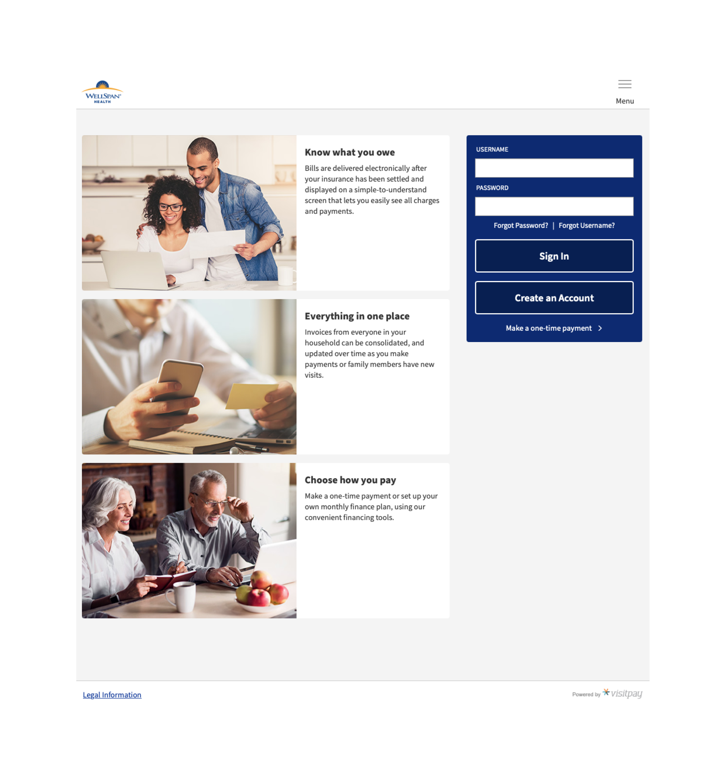
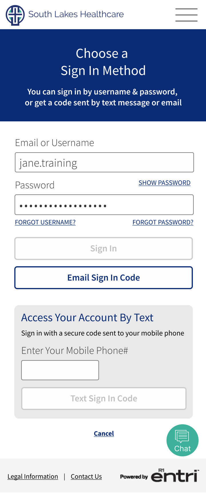
Current UI Design
Design Iterations
We iterated through a variety of different design directions but kept landing on this layout.
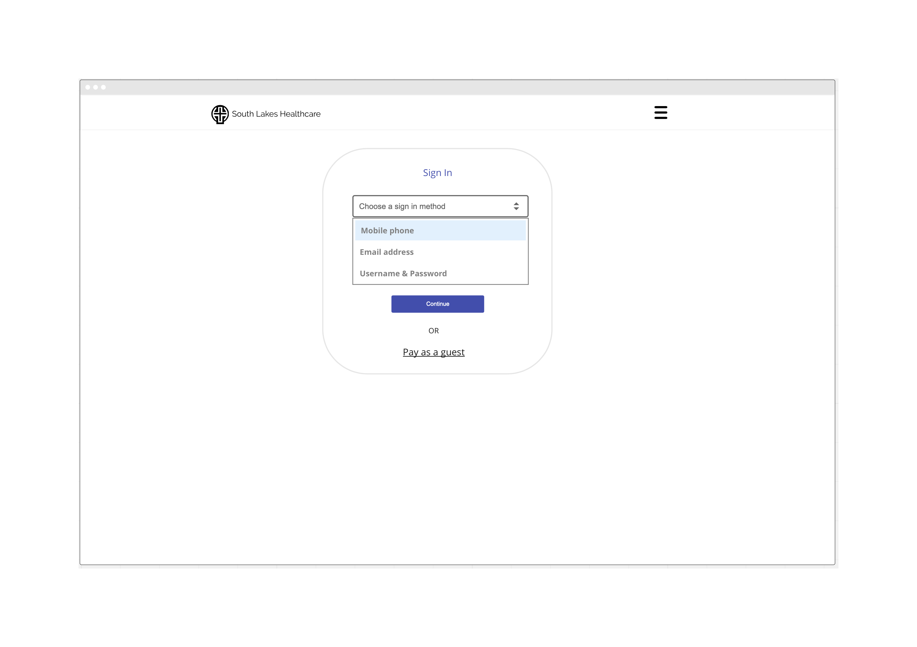

RITE User Study
We collected feedback on our design using the RITE (Rapid Iterative Testing and Evaluation) method. This method is similar to a traditional usability study in that participants are asked to complete predefined tasks. The major difference is that, instead of waiting until the end of the study to make design changes, the team iterates on the design as soon as issues are discovered and then continue testing. This allows us to not only identify usability issues, but to also validate our recommended changes, versus having to run another usability study.
Below are our research questions for this study:
-
Does the multi-option account registration and sign in make sense to users?
-
Is the wizard-like sign in/registration process understandable (stepped approach)?
-
Is the verbiage on the sign in choices clear and understandable?
-
Does the user feel they are safe/secure at sign in? (i.e. Do they trust the process?)

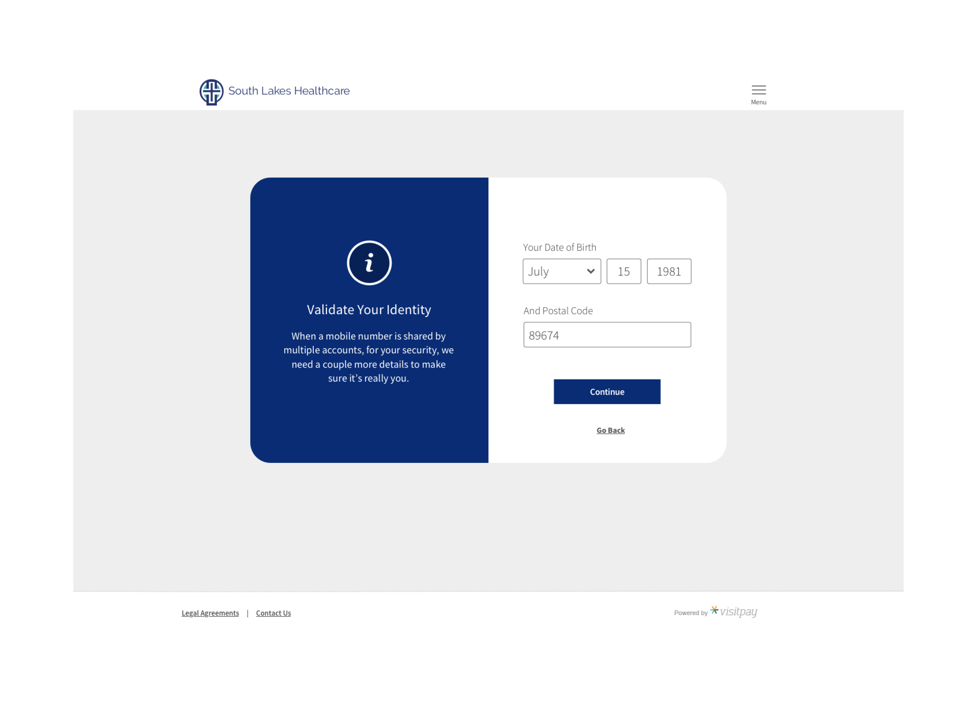

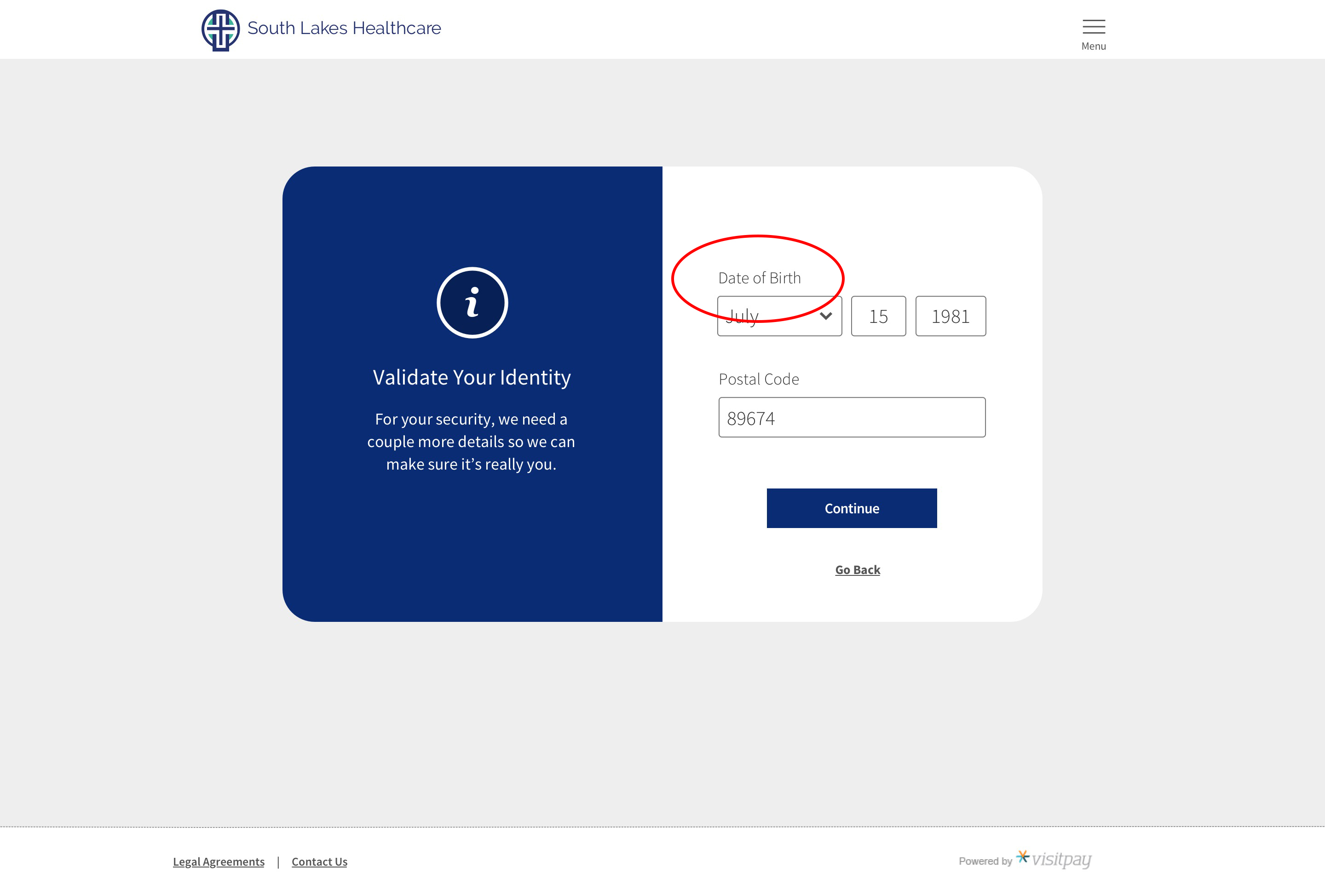
Some Key Findings
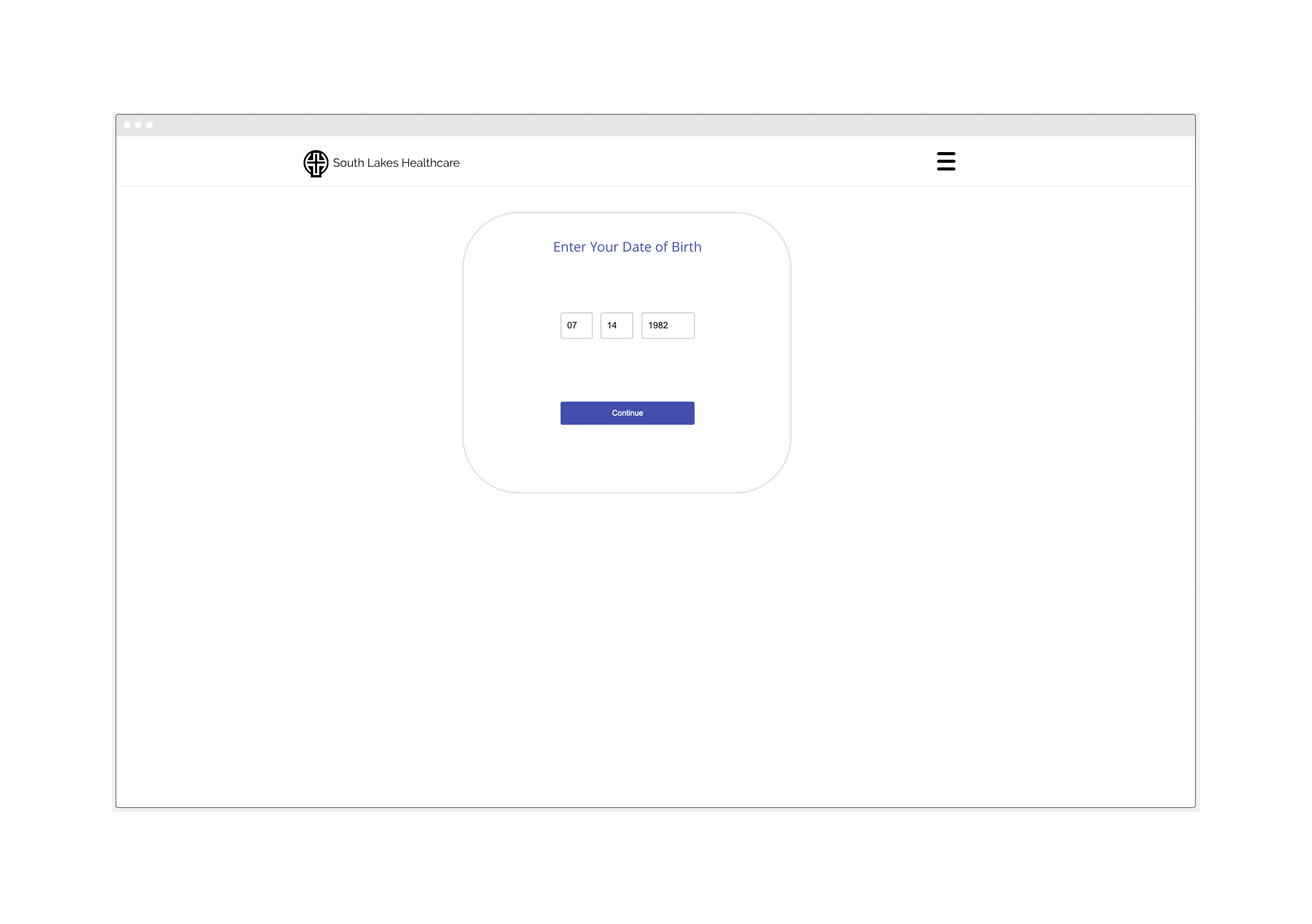
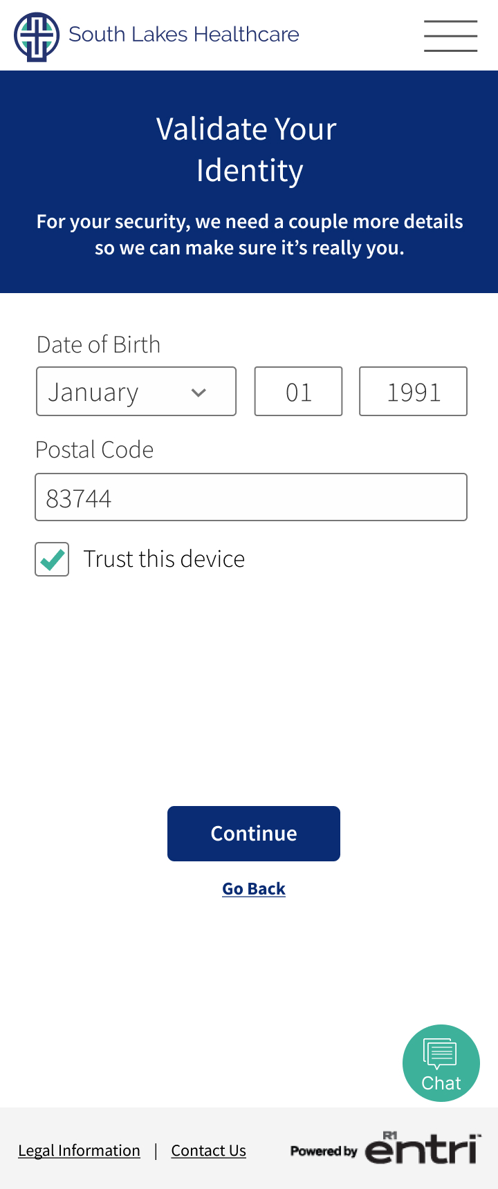
In the sign-in flow users paused at the Date of Birth/Zipcode Validation screen. One user paused and moved on after reading the descriptive text to left. Another user wasn’t sure whether to input their birthday or their child’s birthday.
Resolution:
This issue was addressed by providing more descriptive text to the left and adding “Your” to the "Date of Birth" input label.
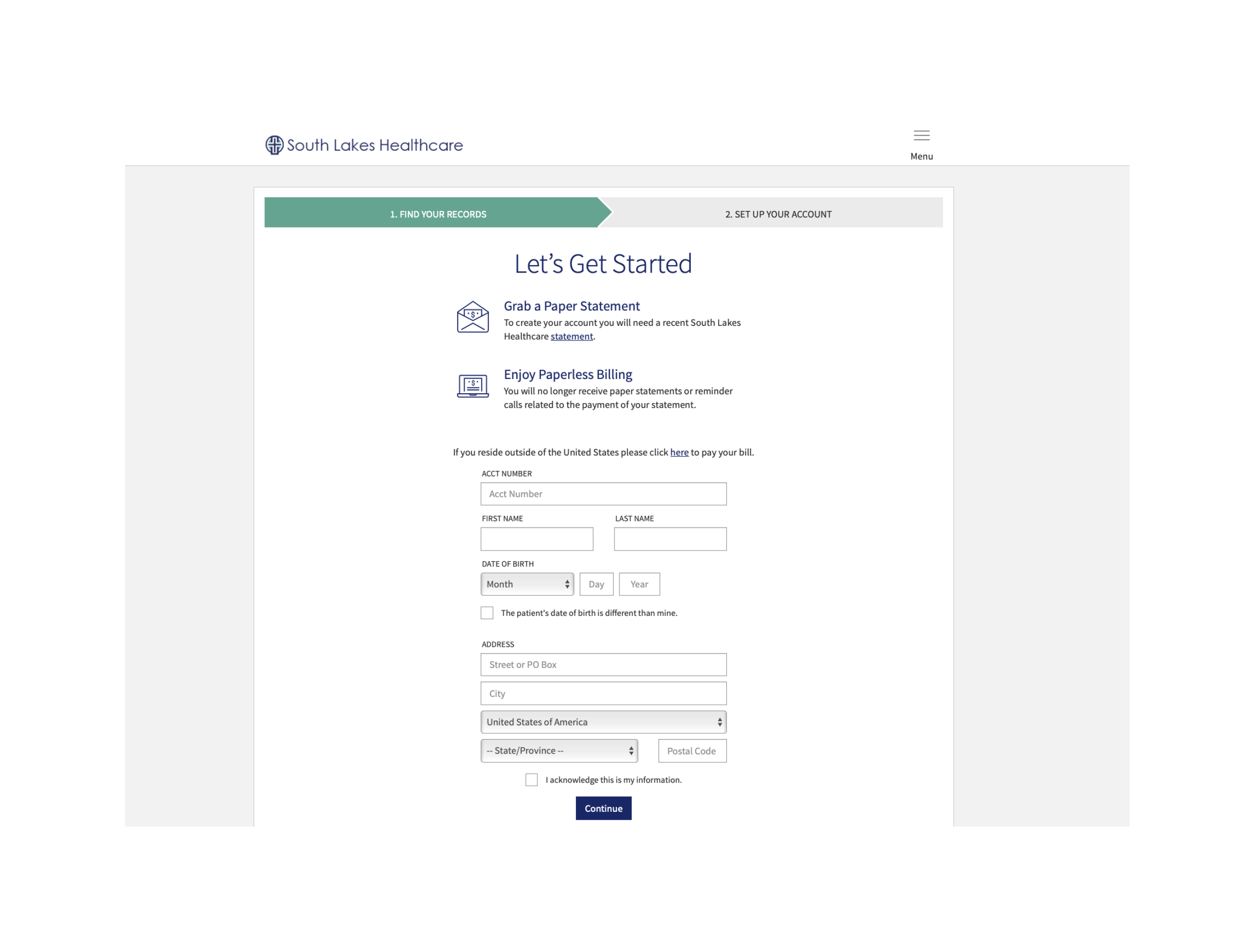
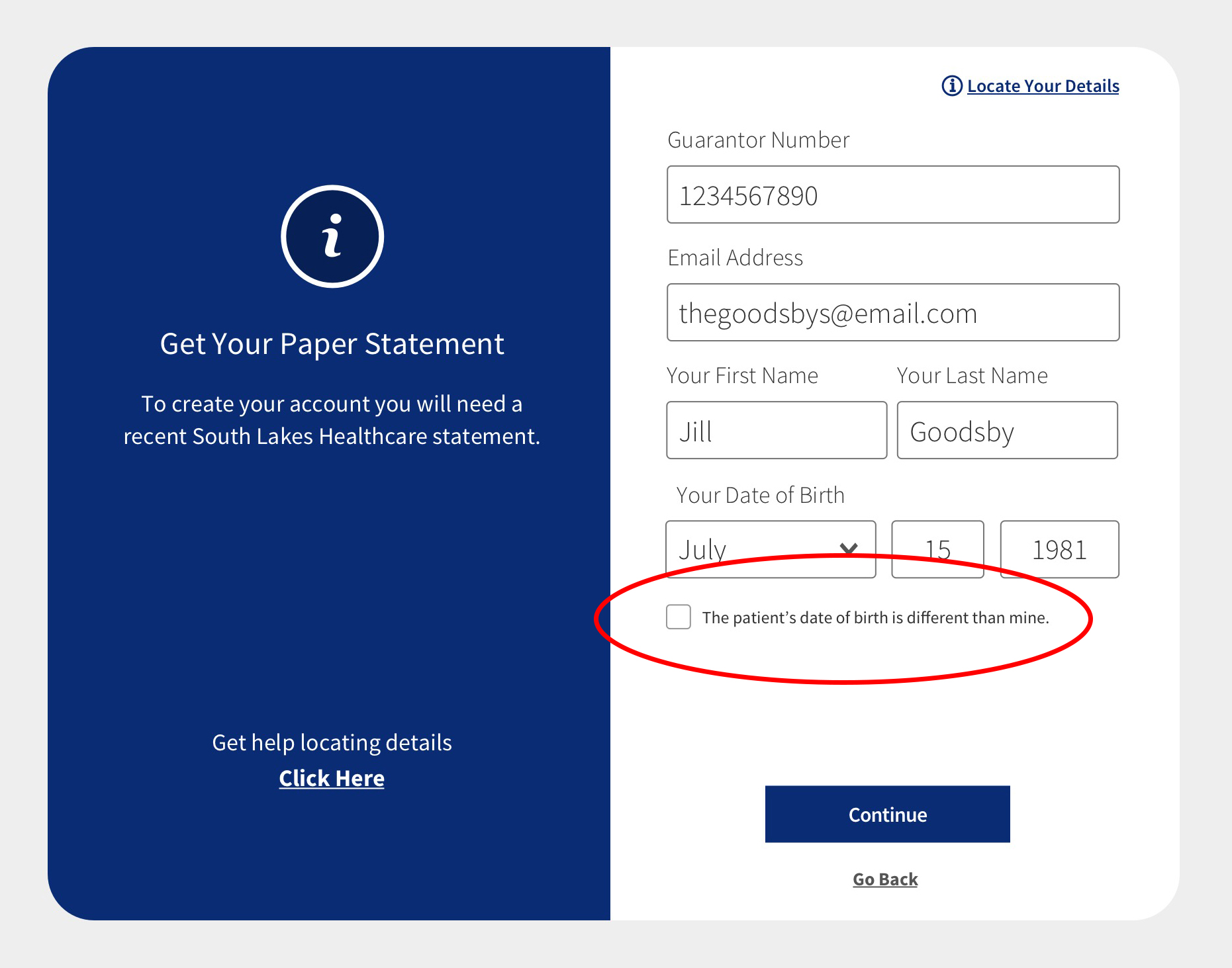
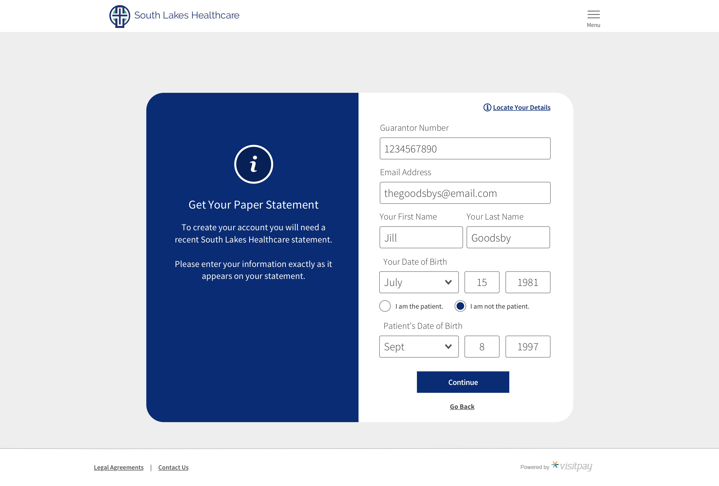
The Date of Birth input on the registration screen was also confusing to users. They worked through the form normally, even entering their own date of birth. Then they would read the checkbox copy, “The patient’s date of birth is different from mine” and they would second guess their initial choice to provide their own birthdate.
Resolution:
As we did with the sign-in flow, we added "Your" to the "Date of Birth" input label and we changed the checkbox underneath the Date of Birth to two radio buttons to help guide the user in understanding whose information is needed to register.
Cognitive Walkthrough
There are some usability issues that may be more easily discovered using other methods. So, it was determined that we should also run a cognitive walkthrough, which is a task-based usability-inspection method that involves a cross functional team of experts walking through each step of a task flow and answering a set of questions from the perspective of a user. The goal is to identify those aspects of the interface that could be challenging for users. During the assessment, the user focuses on a particular task. The task is broken down into individual screens, and three questions are asked of each screen:
-
Is anything confusing?
-
What would you do next?
-
What do you expect to see next?
Key Findings
Registration
-
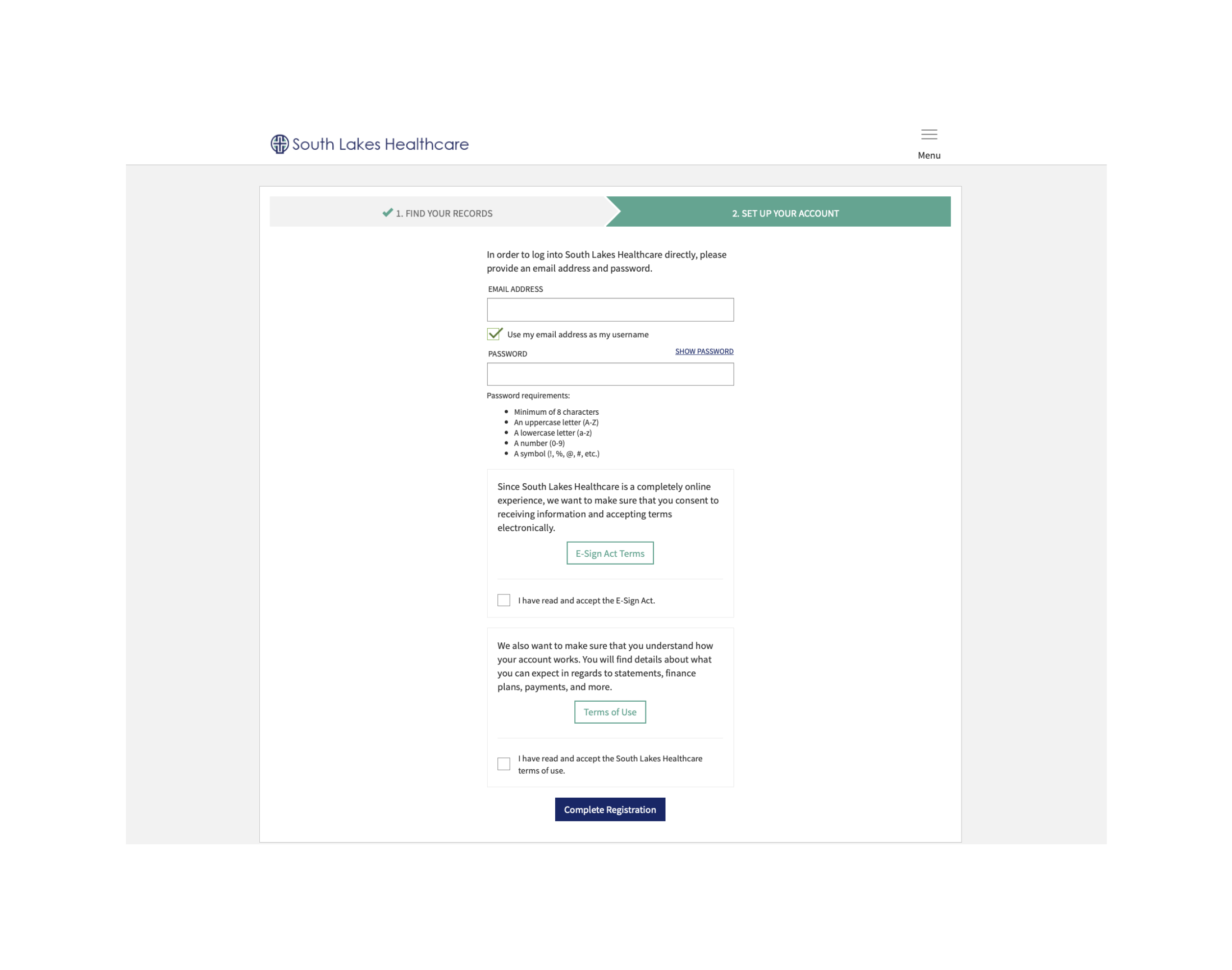
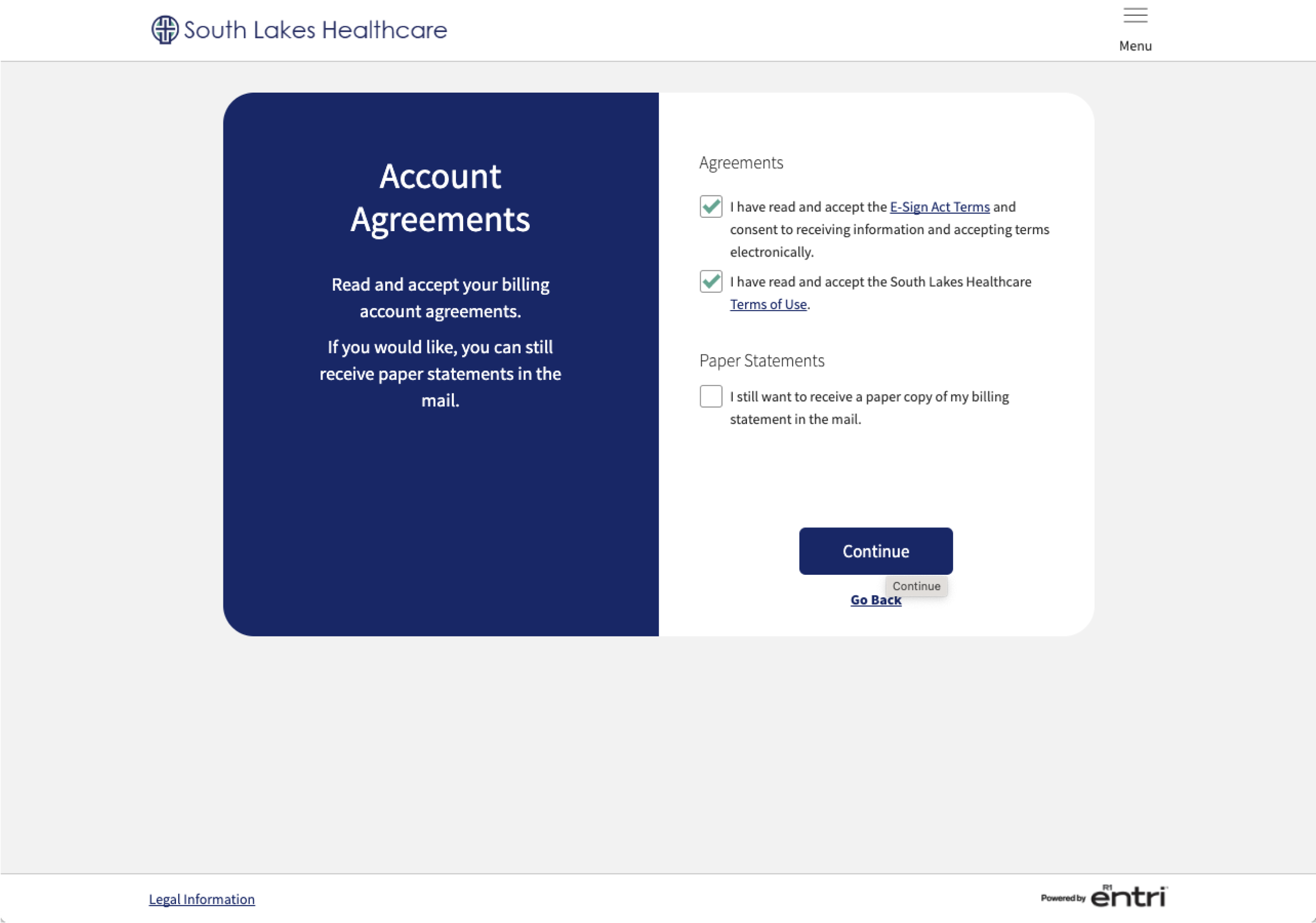
Agreements Screen: The agreements don’t feel like they are in the proper place within the flow. Users thought they would come earlier and were surprised by them at the end.
-
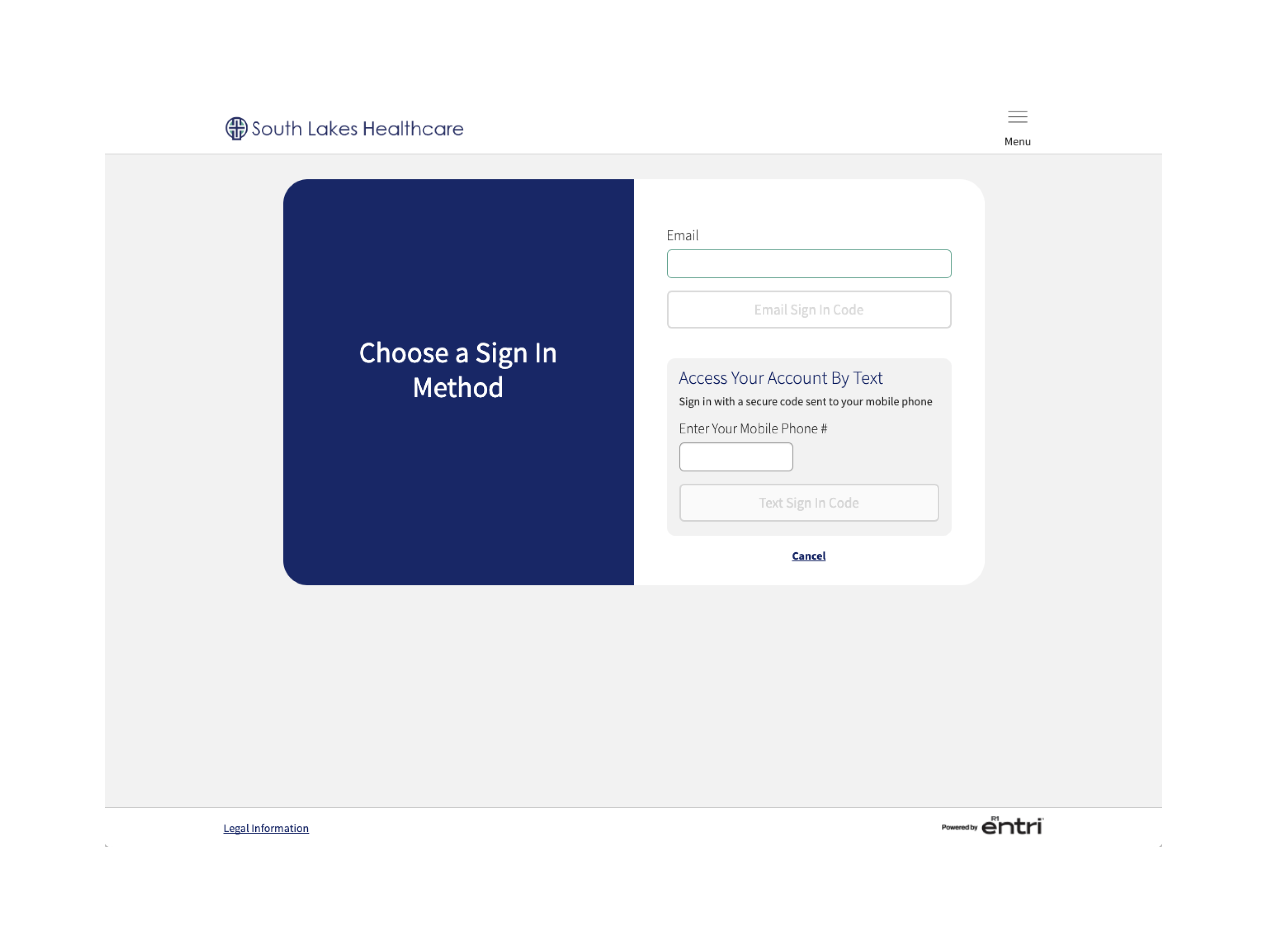
Email Screen: The screen showing email, mobile and username/password contained too many tasks, and users were confused by the note to the left, “Sign in with a secure code retrieved from email or text each time you visit”, when there is an option to add a username and password.
Sign In
-
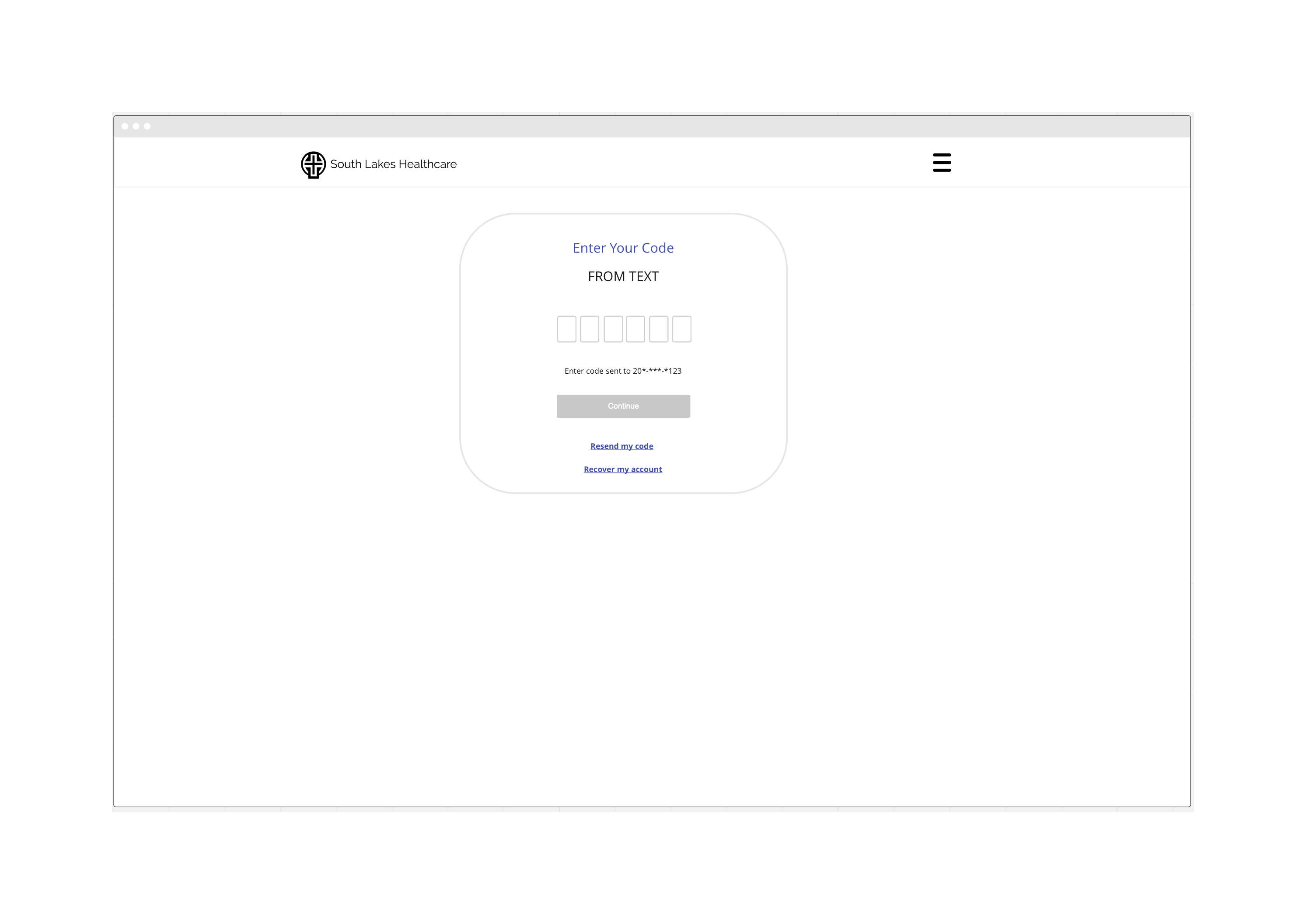
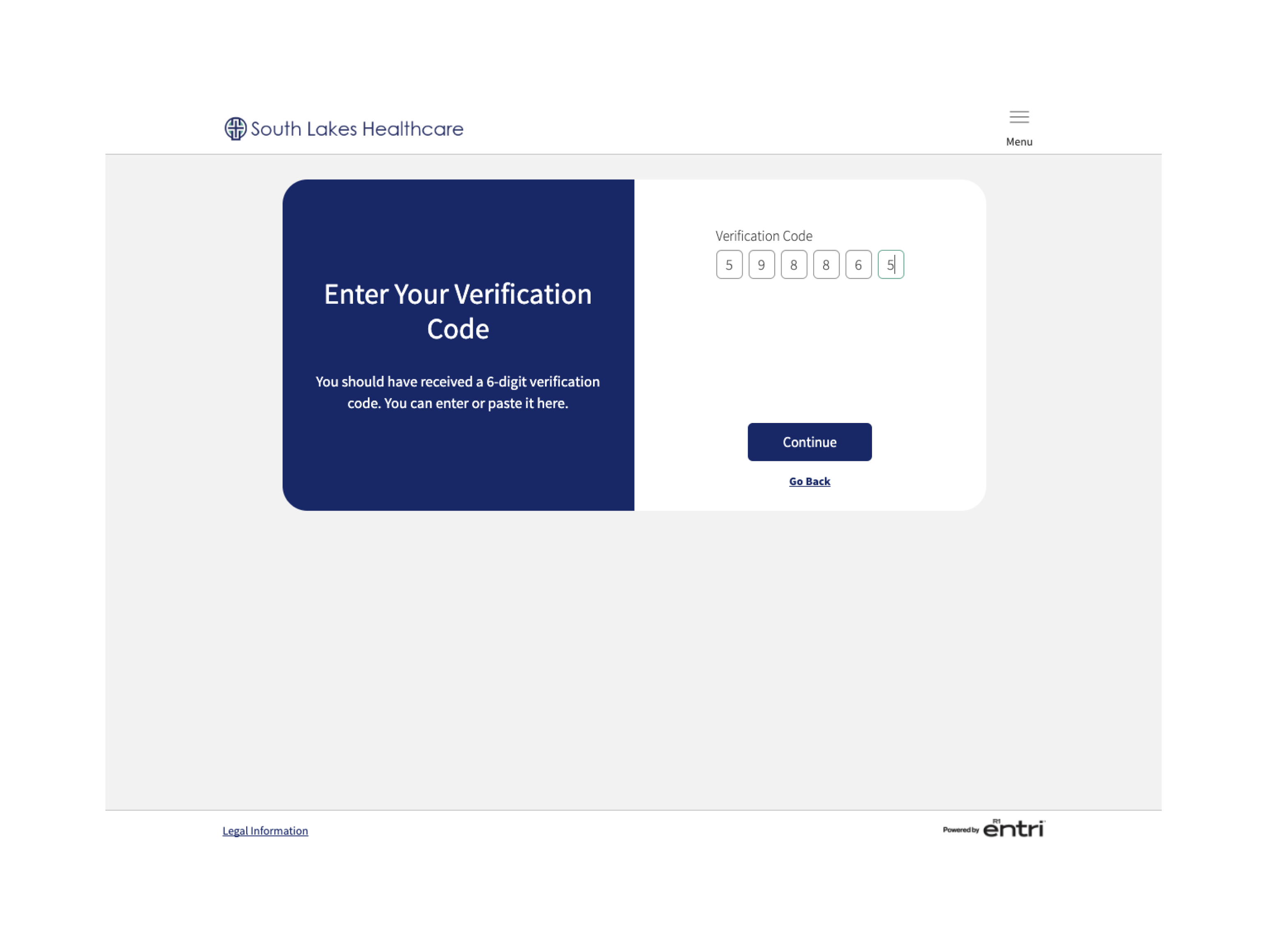
Code input screen: Participants felt a “Resend Code” button was missing.
-
Code input screen: Participants were slow to read/discover the code failure text, and the “create an account” link was confusing since they felt they had already done that.
.png)
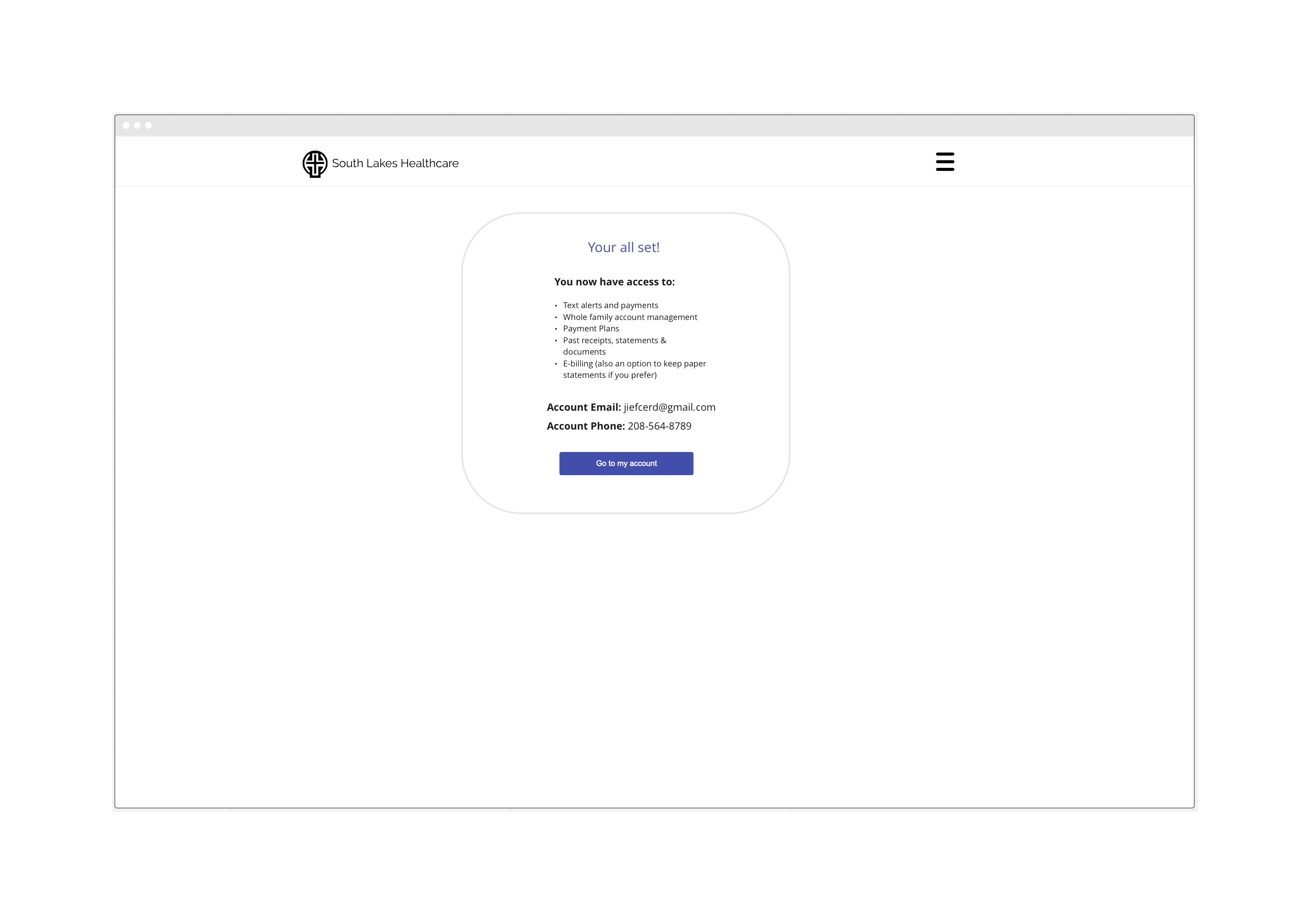
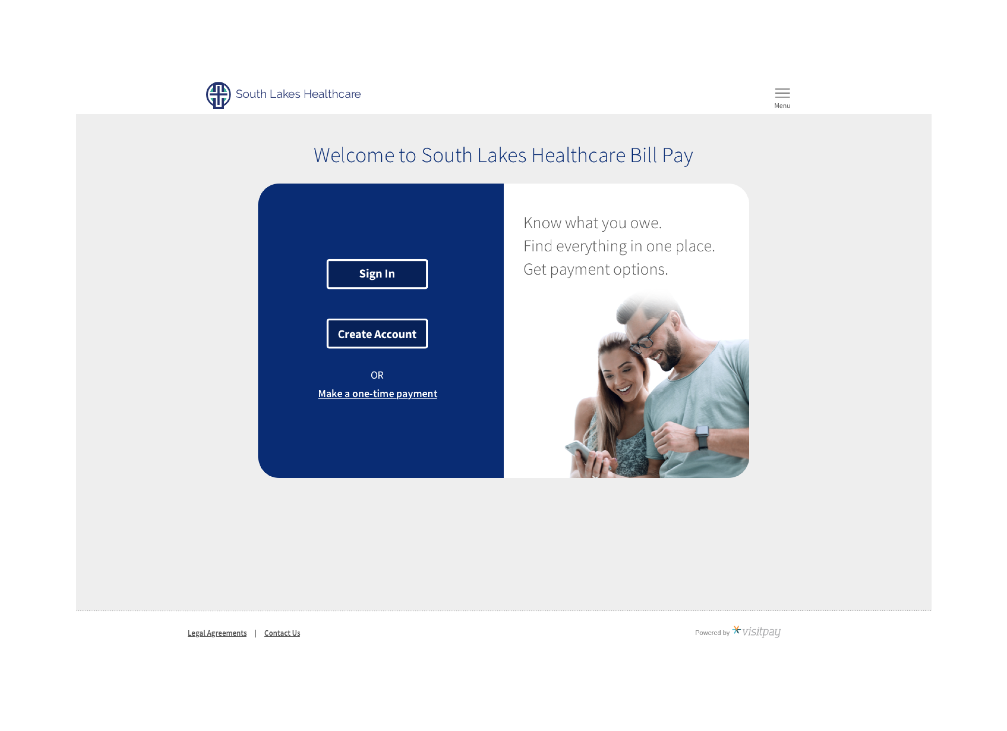
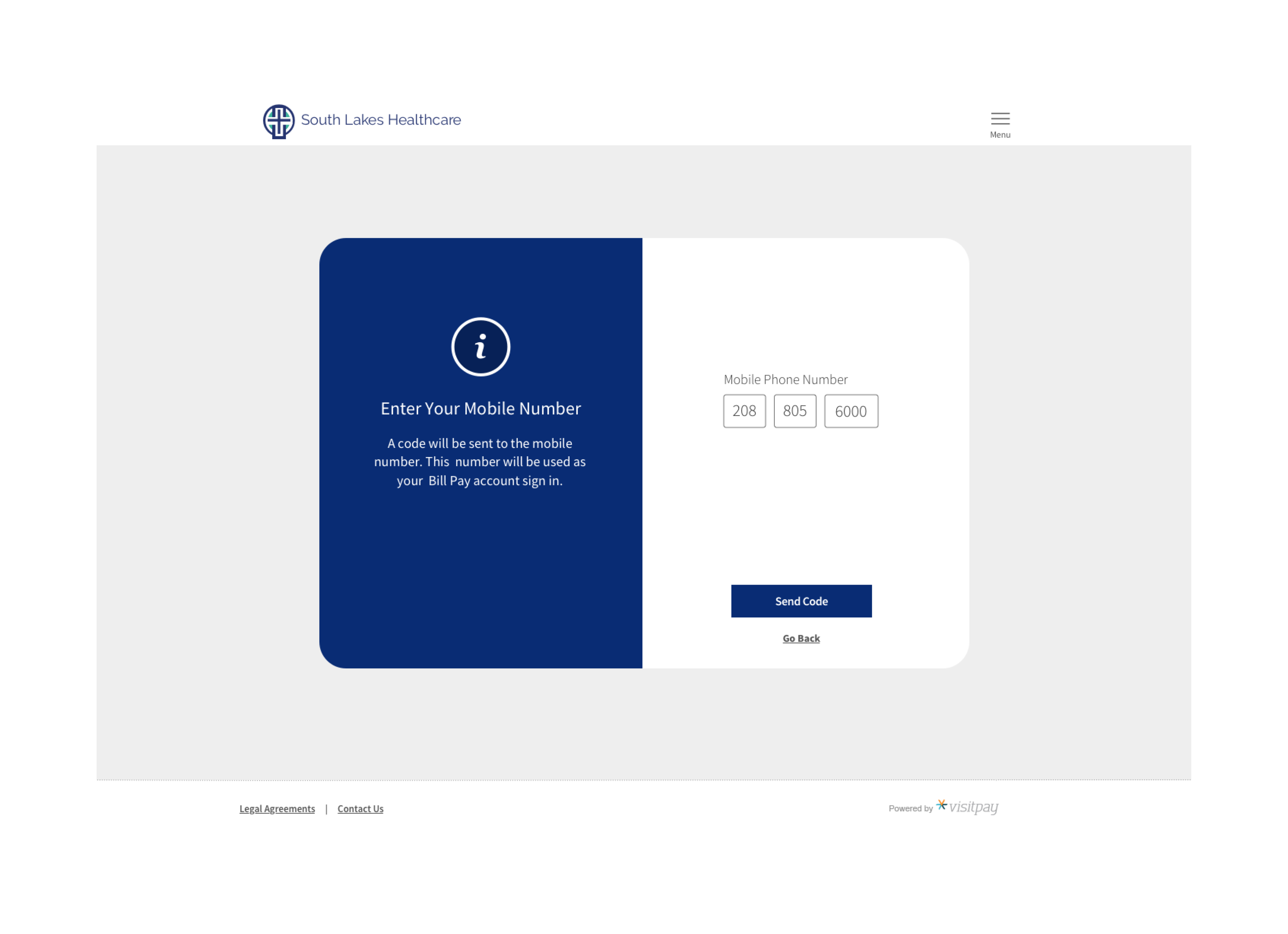
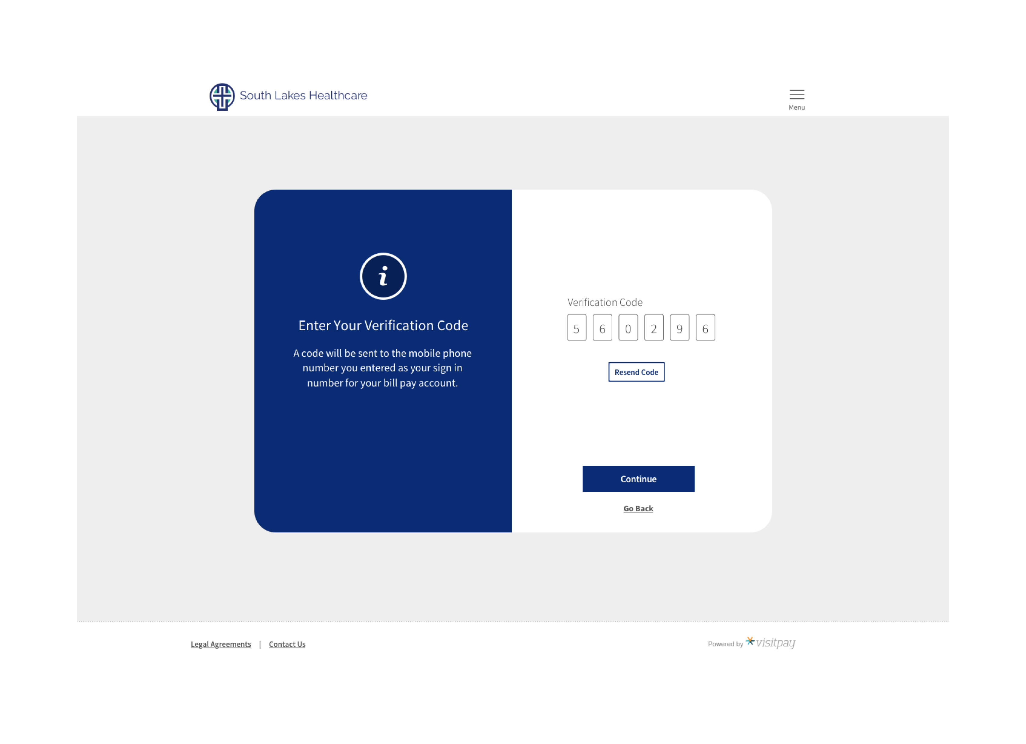
Final Design
Desktop:

Mobile:


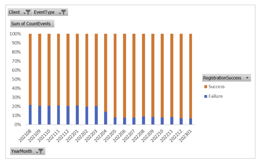
Impact
As you can see in this graphic provided by the analytics team, the registration drop out rate dramatically decreased from 20% or more to less than 10%.